Jonny's Pizza - Visual Identity
Jonny's Pizza, as the name suggests, is the result of Jonathan's dedication to pizza as an excuse to get together. He's part of a wave of young revivalists, both with culinary backgrounds and without, that are determined to bring back the golden age of pizza to New York. After months of recipe testing in an apartment that barely had space for the restaurant-size barrels of flour, the best slice is out in the streets of New York City.
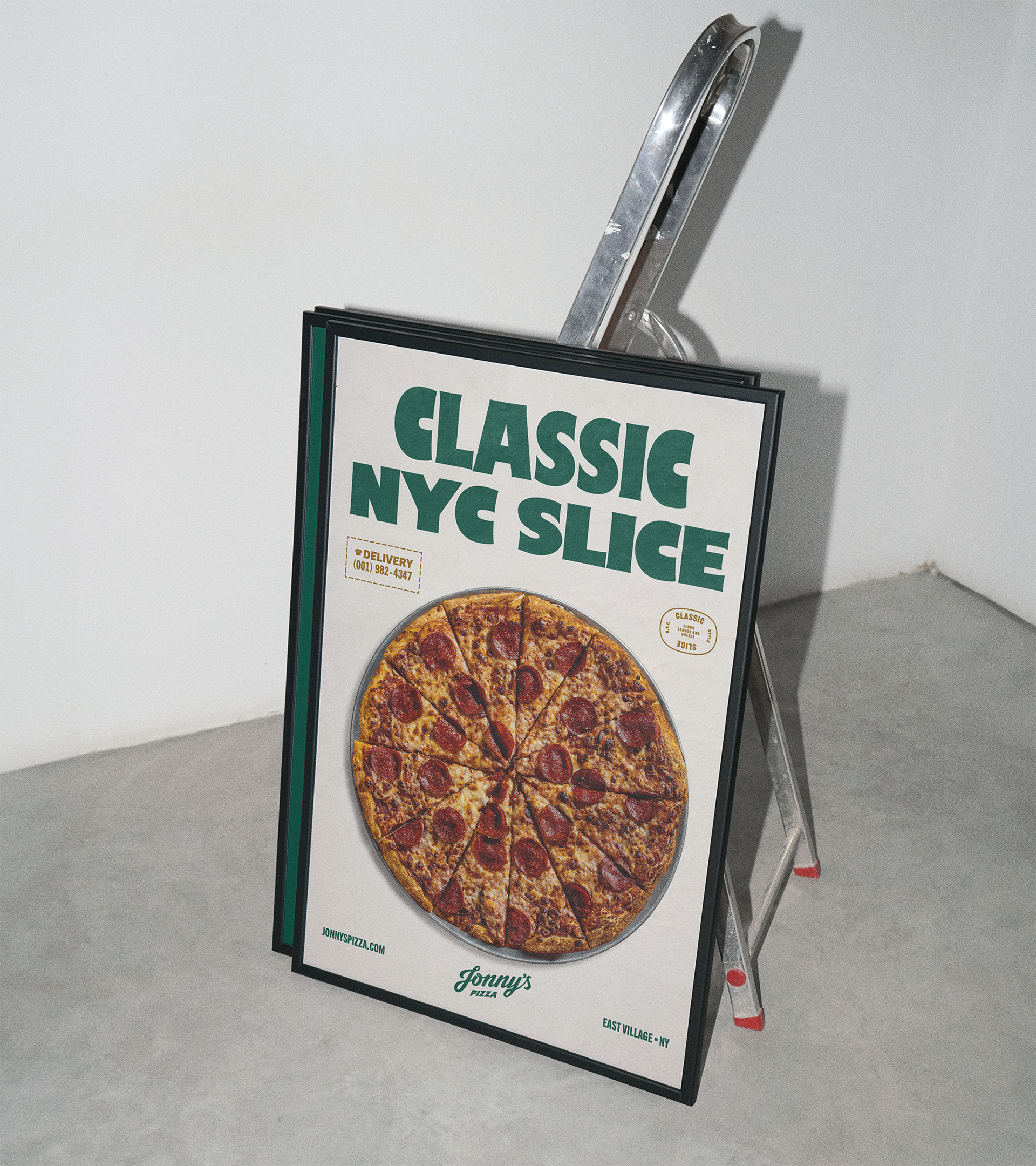
Jonny's Pizza is not trying to make a statement with an innovative pizza recipe, but rather bring the simplest recipes to their best versions, leaning into what makes the NYC slice a classic - a thin crust, fresh sauce, and creamy, quality cheese.
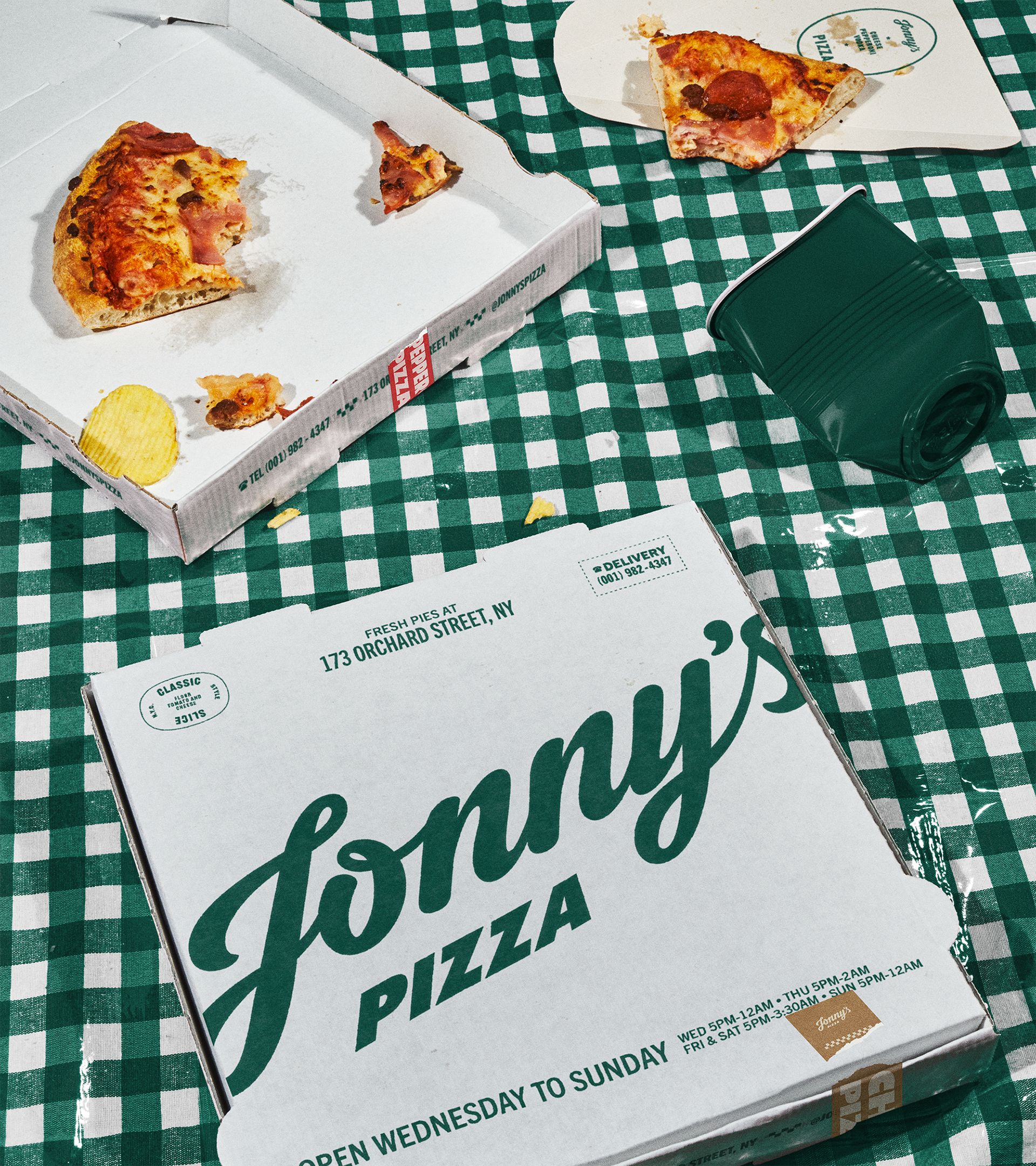
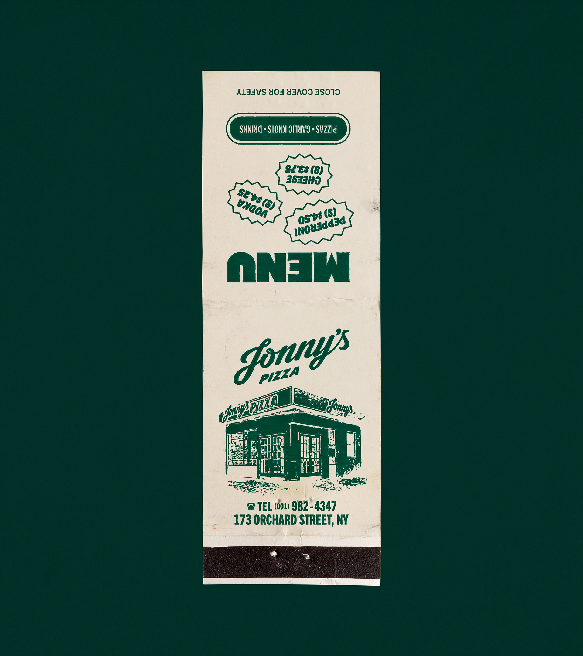
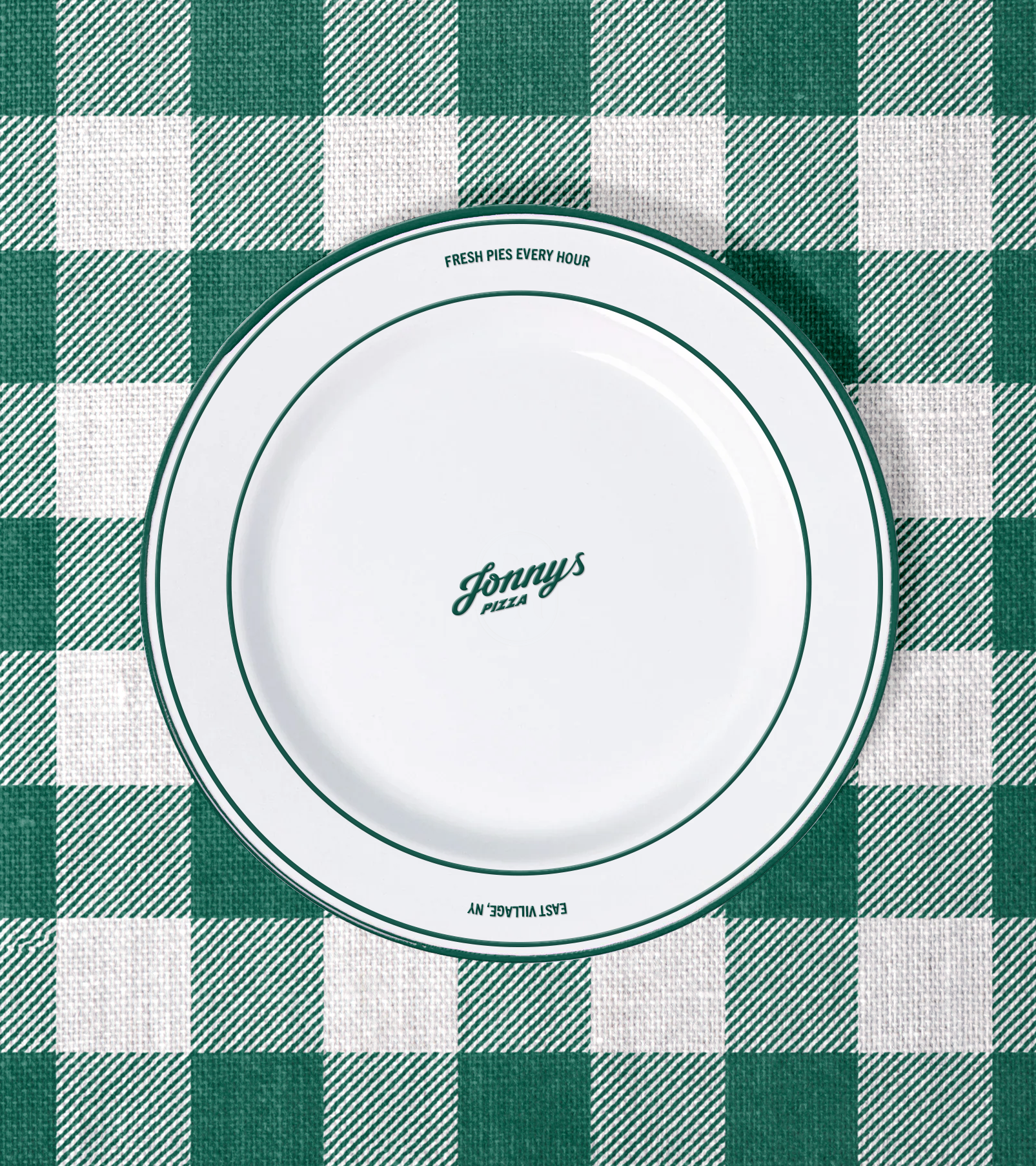
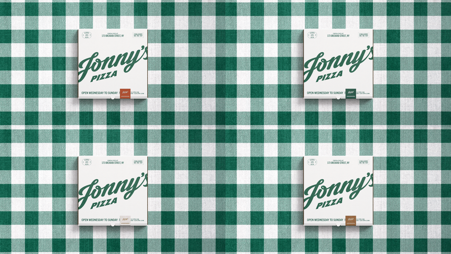
Similarly, a unique aspect of this design is that, visually, Jonny's Pizza is trying to almost blend in, in the sense that the ultimate goal is to look like he had always been there. An unassuming neighborhood gathering spot with a slice that speaks for itself. We were determined to make Jonathan's nostalgic, friendly, and unpretensious but impactful personality shine through the brand.
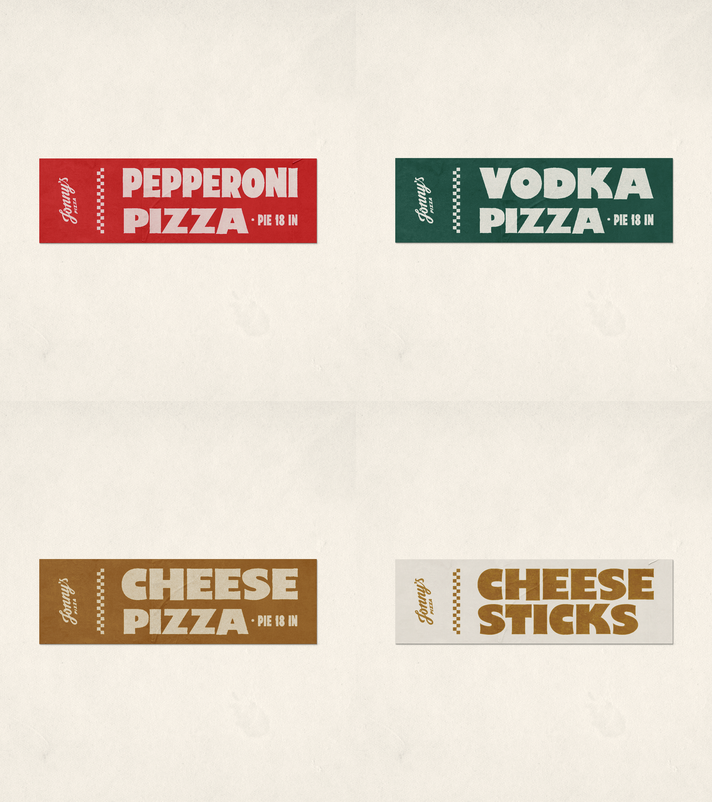
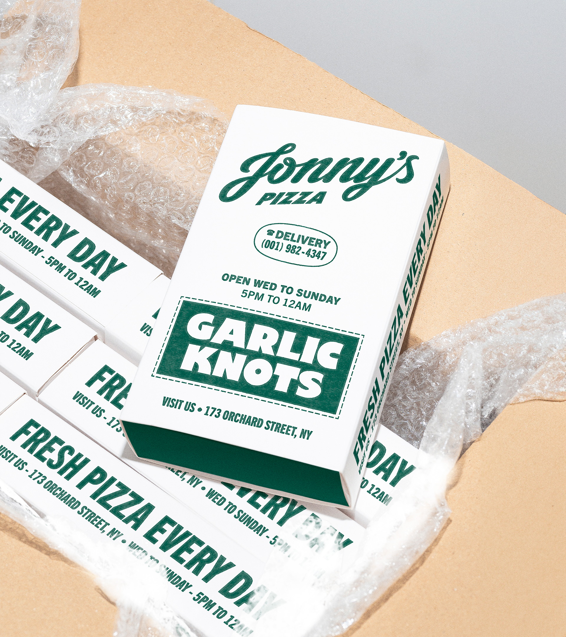
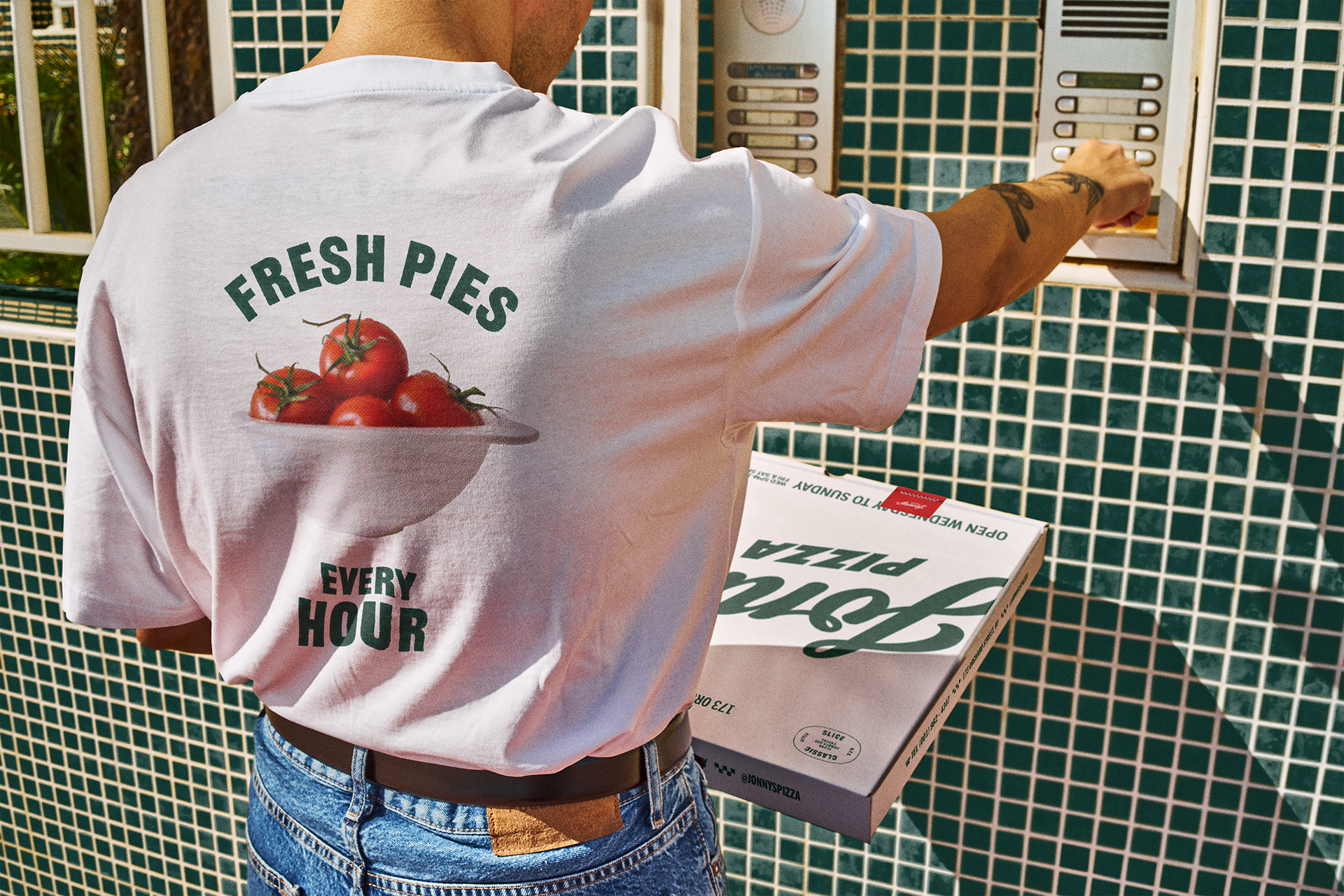
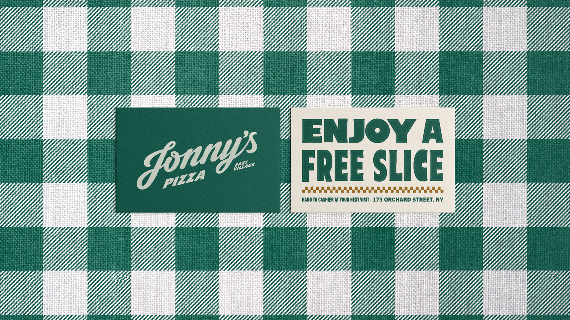
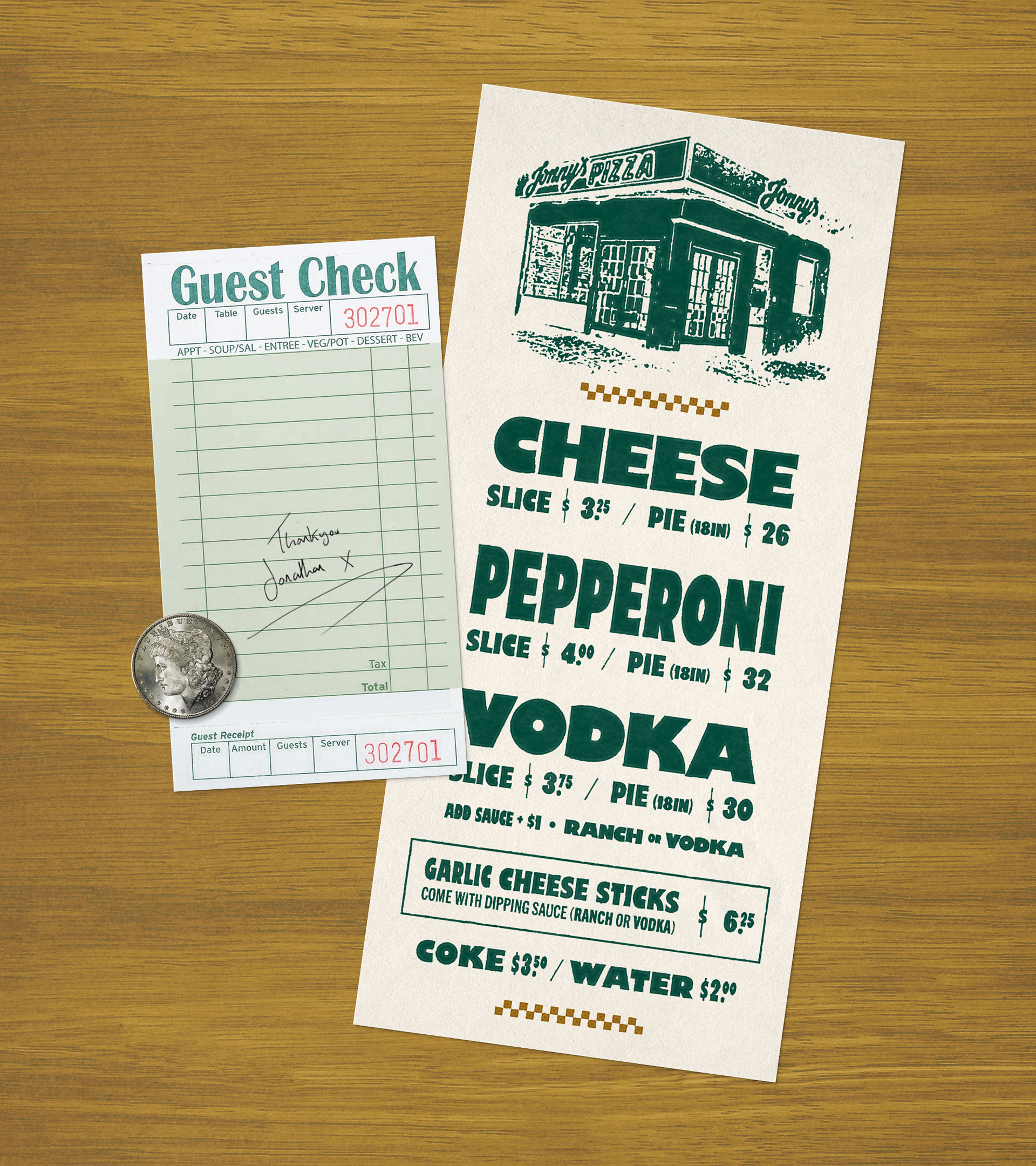
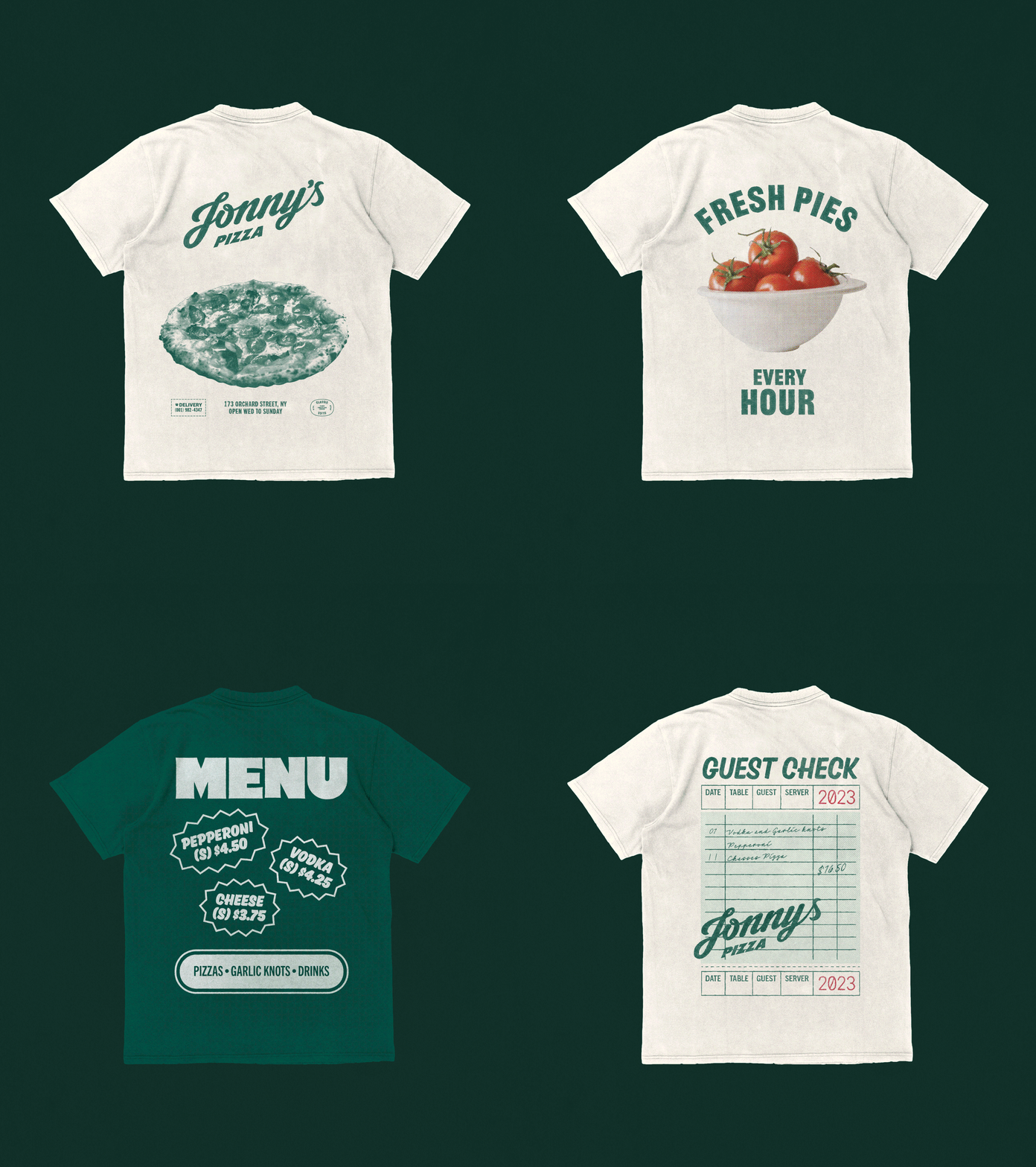
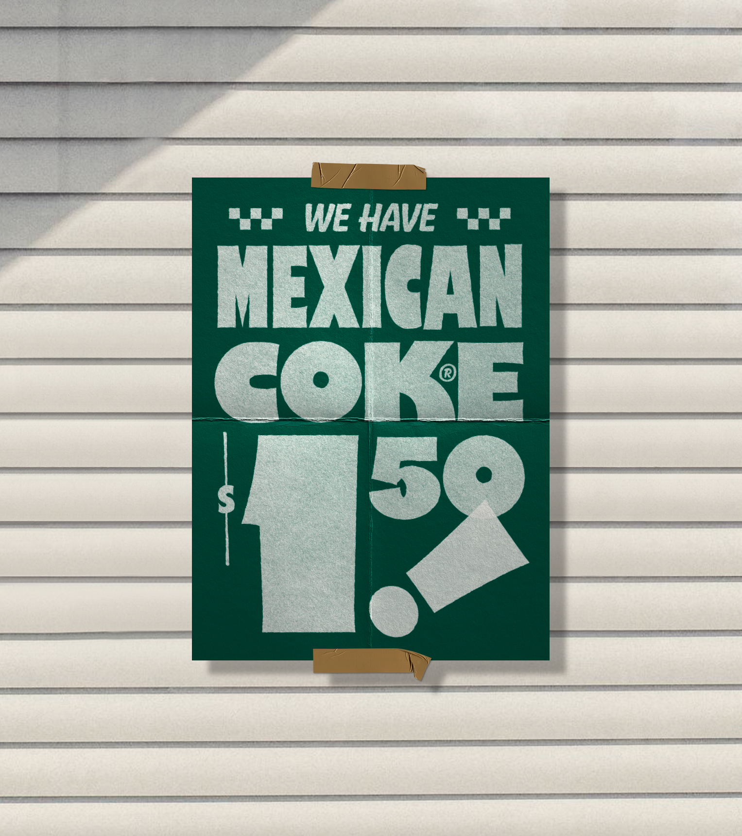
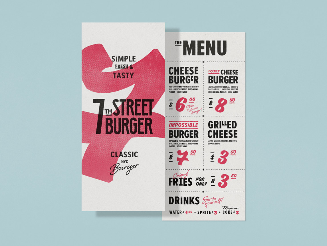
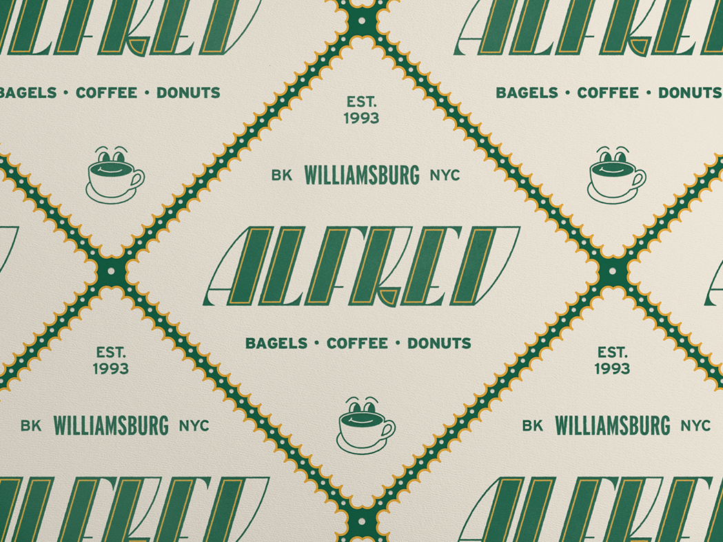
Refining the brand down to its essentials, we invested in handdrawn block letters, few staple colors, a retro script logo and straight-to-the-point layouts. A design that doesn't distract from Jonathan's recipe, letting the elements shine in their bold simplicity. With simplicity comes recognition, and that’s what makes an classic.
Year: 2022
Contact us at alo@vogaustudio.com
