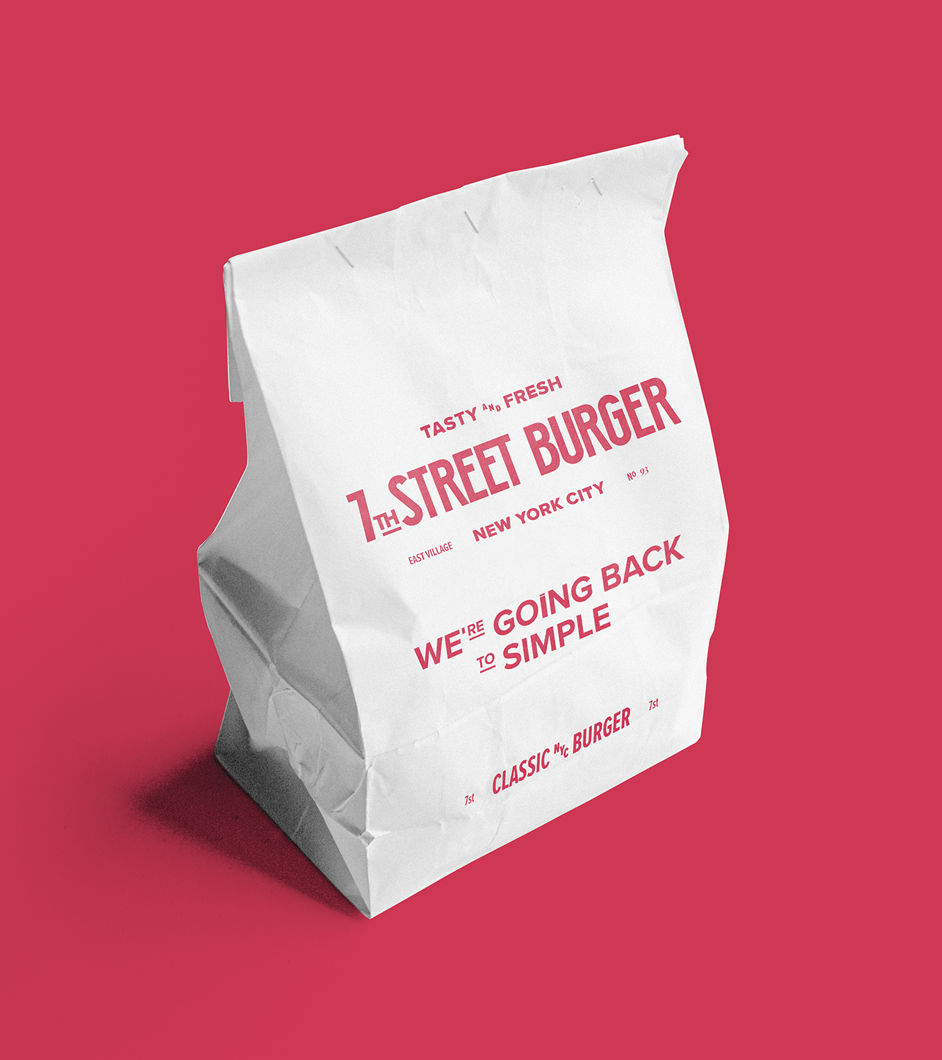
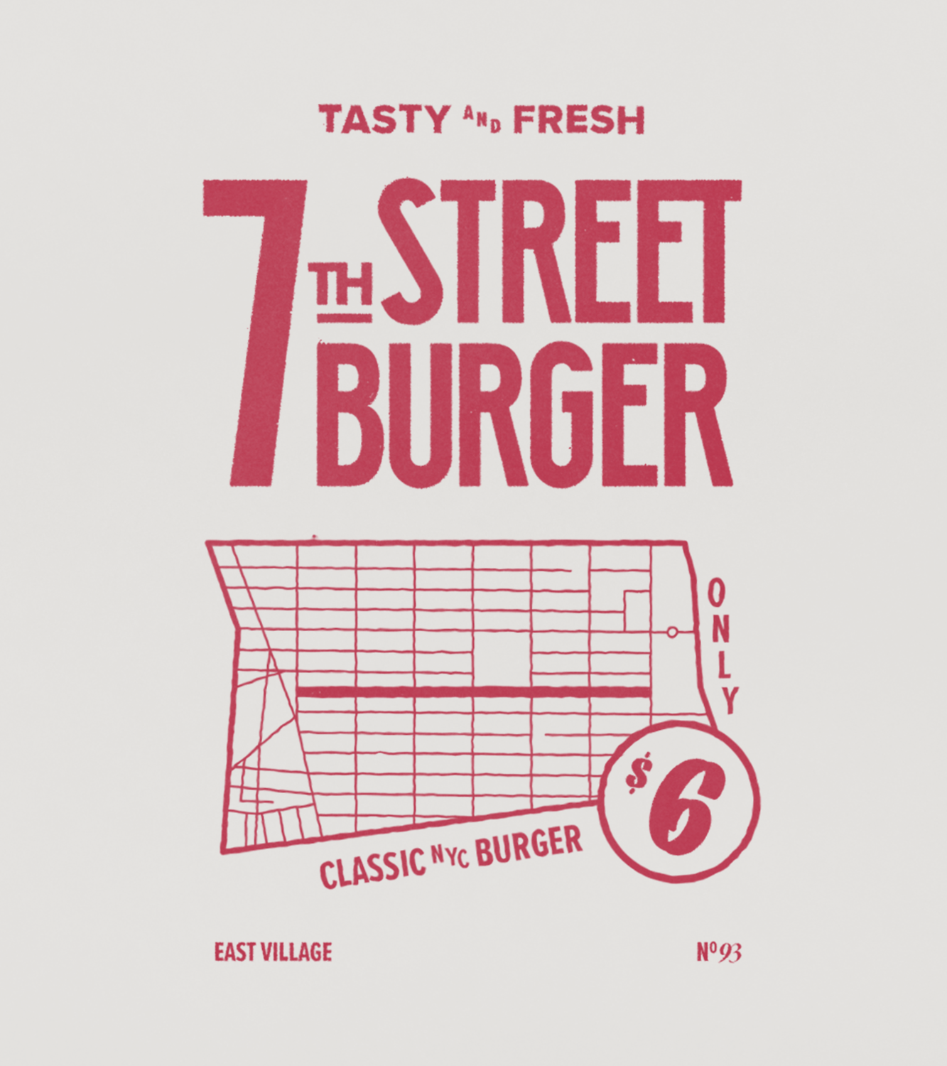
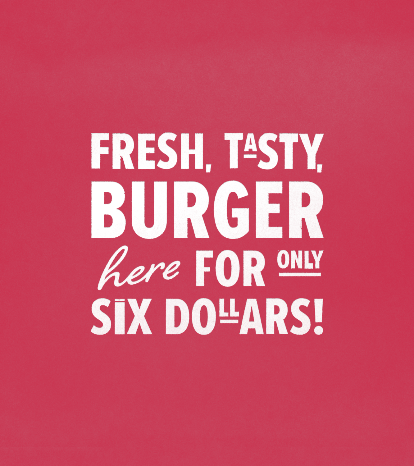
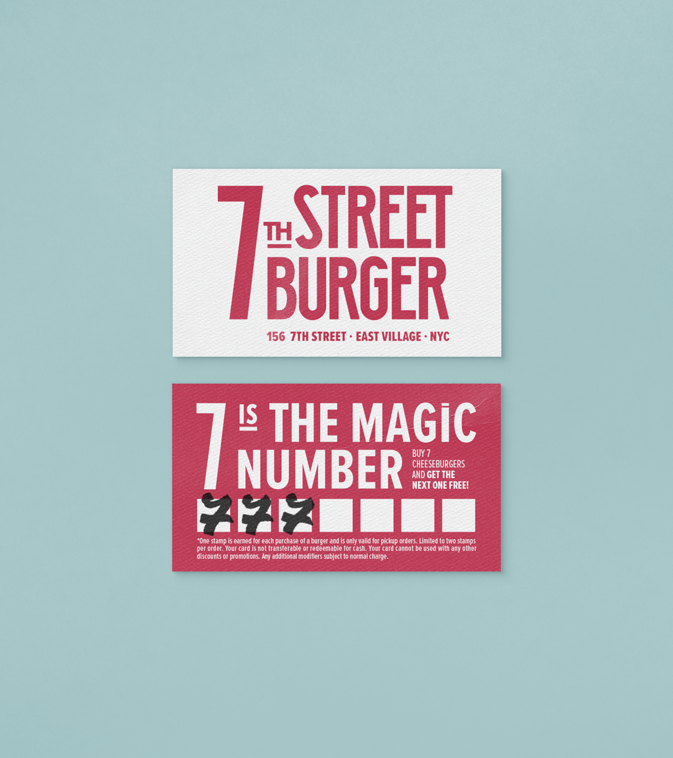
7th Street Burger is a New York burger spot that brings back a classic, affordable and tasty menu - something not as easy in today's New York as it once was. The customer came to us with the descriptive name 7th Street Burger, the street where the shop is located. In addition, a pared-down menu with nothing more than two items: a classic American smash burger with pickles on a soft bun, which can be transformed into a double or vegetarian, and fries. The low prices sought to attract the students from universities neighboring the restaurant, who often gather on the street, especially at night. The challenge was to create a visual identity that would stand out among the city's competitive design landscape, intentionally using resources to create an unpretentious look that was still interesting enough to capture the public's attention.
Solution
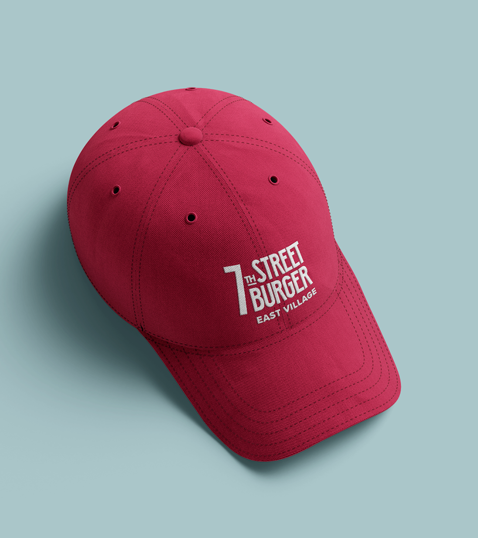
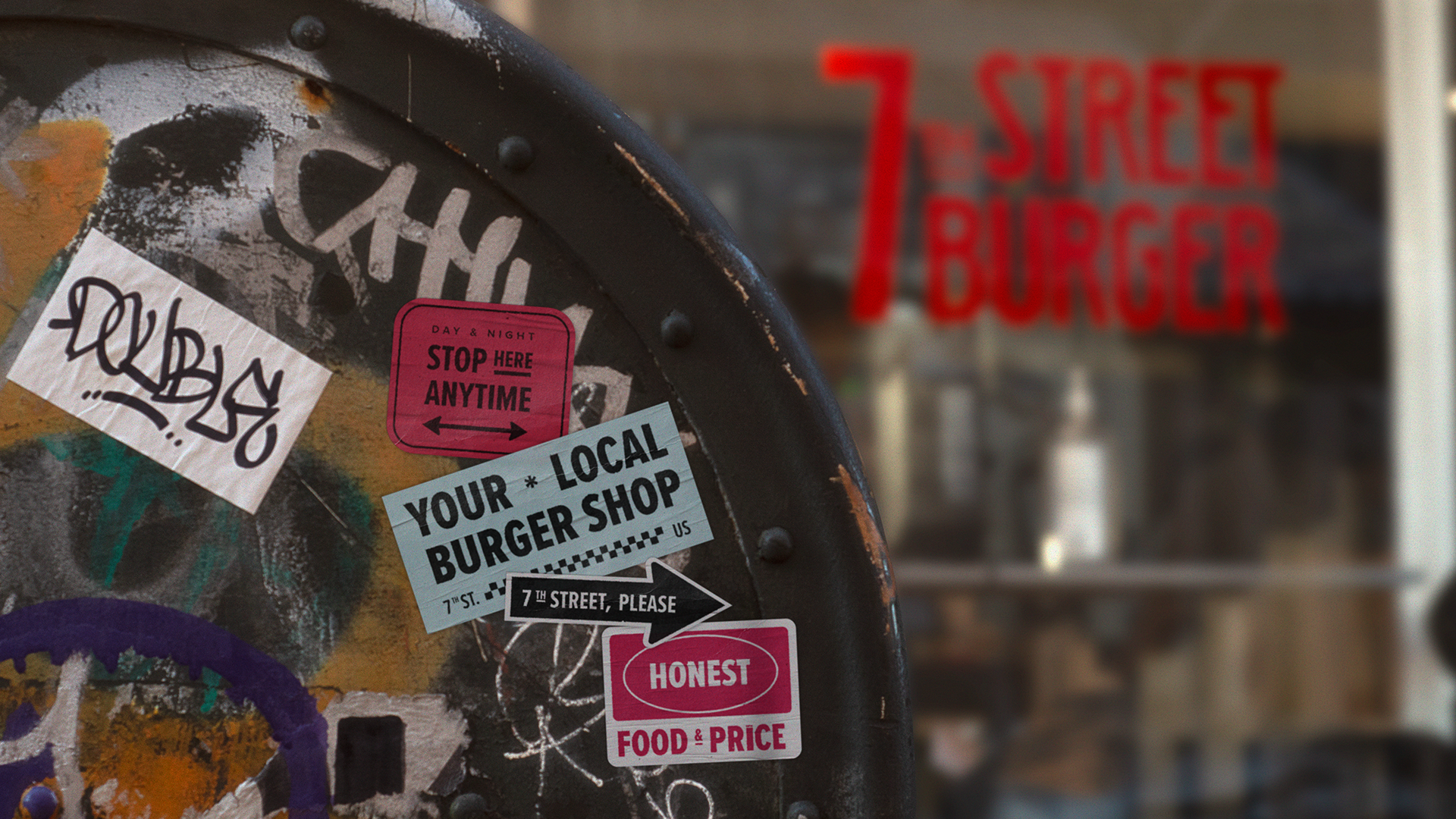
As we observed the visual saturation coming from the infinite options of restaurants and bars in the neighborhood, a visual identity with few but iconic elements was our bet to differentiate the brand. Typography is a strong feature in the city’s scenery, which we brought to the identity of the shop. We referenced the cursive and hand-painted typography that is the face of classic New York delis. We added to this the condensed and wide fonts ever present in street and theater signs, with small customizations that simulate manual printing. The logo itself, with the lowered “th”, nods to the architecture of the small store surrounded by tall buildings. Finally, with a reduced color palette, the identity system synthesizes the unpretentious, classic and urban ambience of the burger shop.
The strategy soon proved successful, with the restaurant frequently running out of orders, earning critical acclaim (such as NY Magazine and Eater) and advertised mostly by popular recommendations from satisfied customers on TikTok.
Cultural Context
New York has a strong and competitive graphic design culture. Likewise, the neighborhood in which the burger shop emerged proved to be an environment saturated with extravagant recipes and visual attractions, often in a tiresome way. These promises frequently raised the price but did not match the quality of the product. In fact, taking a step back and offering the public a basic, accessible and tasty menu paired with a visual identity without excesses was a relief for an audience that wanted nothing more than a good burger with friends at the end of the night.
